Editing the editor.
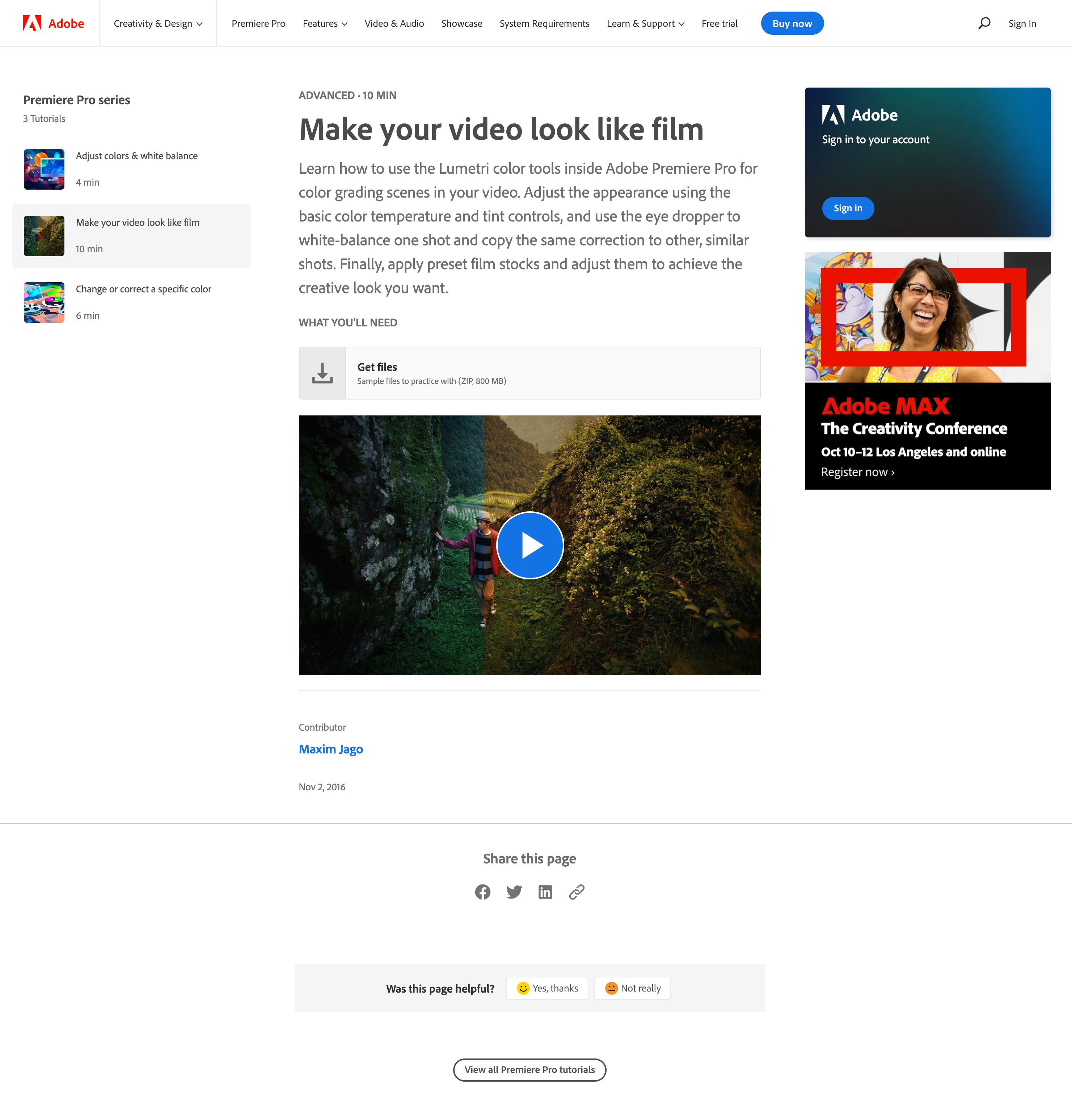
To support the latest release of Adobe Premiere Pro at the time, the product marketing team asked us on the Creative Cloud Learn team to record some short tutorials about the latest tools in the app. Chief among them was a suite of color-adjustment controls in the Lumetri Color panel. Besides using it to correct basic color properties in the footage, editors who were not trained colorists could apply creative color grading and preset film stock and camera looks. One result was the ability to make video look more like traditional film.
Veteran video trainer, editor, and filmmaker Maxim Jago was hired for the task. We supplied him with the demo assets and he supplied us with a 10-minute overview video that guided users through the workspace, tools, and desired workflow.
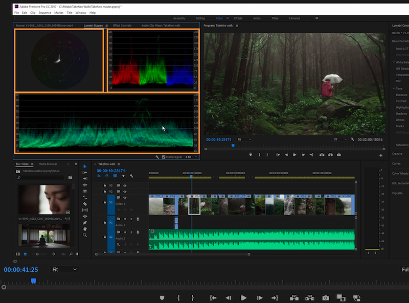
Our demo footage showed Japanese artist and illustrator Takehiro Tobinaga walking along the beautifully evocative Kumano-Kodo Trail in Japan. This footage (part of a “Make It” campaign) was used that year in countless Premiere Pro demos for press, user groups, and Adobe MAX conference attendees.
Maxim’s originally submitted tutorial video flowed well and hit all the messaging points related to basic color grading in the Color workspace; the ease of adjusting temperature, midtones, and white balance; and applying one-click creative looks.
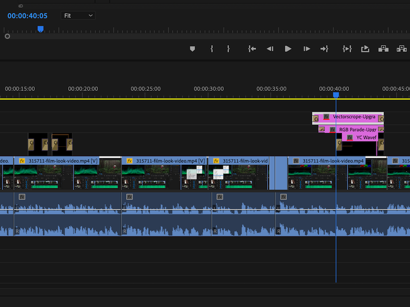
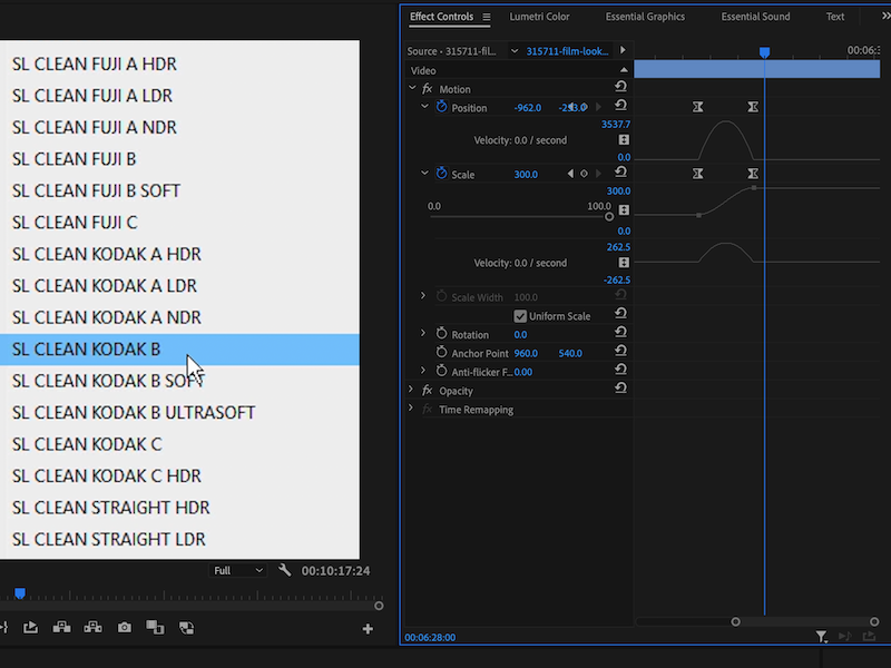
Like any good visual presentation, however, it needed to hold the viewer’s attention. It was my task to add highlights, zoom-ins, cuts to close-ups, and frame holds to help the audience notice the important elements of the screen at any given moment. I found places where subtle visual timing adjustments helped the overall pace of instruction and improved comprehension and retention. We generally asked our presenters not to do this time-consuming work themselves so that they could focus their time on perfecting their delivery. The less they baked in their edits, the more flexibility we had to make changes later.


